
ZPE UI, the official plugin, has been maintained from time to time because, to be honest, it works quite nicely. But the biggest problem with it is that is a plugin, which means no ZPEX.
In addition to this, since ZPE UI is built in Swing, it cannot be used by ZPEX, even if it were embedded straight into ZPE.
So here's the plan:
- ZPE UI will continue to be a plugin for ZPE itself
- ZPE will soon begin to bundle its own UI building toolkit
- ZPEX will be able to use the new UI building toolkit
This will require a lot of work. I'm hoping this will be ready for release in September at the earliest, with previews running through August.
To be clear, this will not be replacing the standard editor built into the ZPE package yet, but at some point it might. For that, I'd direct you to ZIDE, which is already an excellent IDE for ZPE.
ZPE 1.14.8, already shaping up to be the best release in ZPE history, is getting even better: this time, it's getting the newly completed Python, PHP and the new JavaScript transpilers built in.
The main reason behind this is to provide ZPEX with the ability to use transpilers.
One big benefit is that these are very lightweight, so they add very few additional storage requirements to the ZPE JAR or the ZPEX binary.
And, best of all, I'm going to continue to maintain and update the plugins, which can overwrite the built-in transpilers (and actually, when updates come to the plugins, they'll also come to the release version of ZPE, since ZPE itself just bundles the actual plugins).
There is one breaking change in ZPE 1.14.8, and one that I should have broken years ago:
If you're working in an object, and you reference a property of the object in a function just by using its name (e.g. $begin), ZPE will no longer treat this as an object property, just a local variable. You must explicitly reference it with this, (e.g. this->$begin).
I shall let this post from my Bluesky account summarise this:
I honestly cannot believe this, but the new ZPEX 1.14.8 has brought compile time right down. I mean, right down, we're talking from ~390ms to 7ms after I made a few little changes here and there! This is one of the most revolutionary moments in ZPE's history.
— BALF (@jamiebalfour.scot) July 18, 2026 at 9:10 PM
This is a remarkable result, and one I most definitely did not expect. ZPE compiles considerably faster due to improvements to the Zenith Parsing Engine (now version 1.6). This also improves:
- The JSON parser - used frequently in the ZPE Runtime Environment (ZRE).
- The CSV parser
- The XML parser
- The TOML parser
- The INI parser
- The JBML parser
- The YAML parser (coming this year)
This is, without a doubt, one of the biggest improvements in ZPE's history, especially in the compiler. This all goes back to ZPE version 1.5.3 back in 2017, when I introduced a separate parser and compiler, which led to performance gains back then. But the next big improvement was tonight's improvement, and I still cannot believe it.
It means that there will likely be no need for any more improvements to the compiler unless they benefit the runtime.
I turned 35 today at 10:30. I'm actually shocked that I'm now half my dad's age as well.

If I look back to my late teens, when my health was grim compared to now, things have improved a lot.
This was, however, also the first birthday without my auntie Deirdre. I still can't believe I don't have her anymore.
Anyway, from tomorrow onwards, I'll be closer to 40 than 30. That's absolutely nuts!
I am shocked to be saying this, but ZPE 1.14.8 is already up to five times faster than ZPE 1.14.7, which was already up to three times faster than ZPE 1.14.6!
This improvement has come from many changes in the runtime, ranging from variable and function lookups to how expressions are evaluated.
For comparison, here are the times for running the Standard Algorithms library:
Timer finished : 53ms
zpex -r stdAlgorithms.yas 0.56s user 0.04s system 95% cpu 0.623 total
Timer finished : 136ms
zpe -r stdAlgorithms.yas 2.22s user 0.24s system 336% cpu 0.733 total
After countless hours of development and over 3,000 builds, VWS has finally left beta and is now available as a working web server, supporting a variety of different features. Here are some of the key features (as well as some of my favourites):
- HTTPS and TLS support (at last)
- Unix socket support for connecting to PHP FPM
- ZPE PM support from the box
- Easy to write handlers
- Web assets and bundles; /__vws_asset/ and /__vws_bundle/ (more below)
- A control server (vws --control)
- A Let's Encrypt installer
There are caveats to its use currently, however. For example, the Let's Encrypt installer is not perfect and is more Unix-oriented than Windows-oriented.
Now I mentioned vws_assets and vws_bundles. These are among my favourite features in VWS. These are clever little ways of simply including a library and VWS includes many by default. For example, let's just say I want jQuery on my website. I simply include the URL,
/__vws_asset/jquery/
and VWS will provide jQuery. It will have jQuery pre-fetched, since the bundle will be downloaded first.
But bundles are even better. We use them as follows:
/__vws_bundle/jquery,react,vue/
and VWS will combine these into a single file, thereby reducing HTTP requests and maintaining optimal speed. Not only that, but VWS will also keep a cache of these bundles to ensure it can quickly find them again.
Back when I was at school, especially during Higher and Advanced Higher Computing, my teacher (who is also now my colleague) inspired me to use mind maps. Throughout my own time going through education, my undergraduate Computer Science, my PHd and my Post-Graduate Diploma in Education (PGDE), I have used mind maps in one way or another.
I was initially familiar with Mind Genius and obtained a copy from Heriot-Watt when I started my undergraduate degree. Whilst I found my undergrad easy enough and second nature, some elements of it were not. Particular areas around mathematics in computer science were the key points where I struggled. Mind-mapping the key ideas was really useful for revising and understanding the issues I might have.
Anyway, fast-forward twelve years, and I'm teaching and finding that mind maps are a great resource to help pupils, just as they did for me. However, I'm limited.
So this is where it gets fun. Three or four weeks ago, I was making my final preparations to present my practitioner enquiry, which focused on recalling key information. My main focus here was using mind maps to help pupils recall information from what they already know before we start a new unit of work. I had been using draw.io for making mind maps and found it's very powerful, but not specific enough for anything - it's more of a UML application than anything.
So, as I do with most things, I decided to break the wheel. And then reinvent it.
What I mean is, meet Balf Mind Map. It's free, no data is collected, and no login is required, which is crucial for schools.

As the title of this post says, I simply cannot believe this is now on macOS.
Given that it already works on Linux, it shows shifting attitudes toward other operating systems with growing user bases.
ZPE 1.14.6 is another big update, with the introduction SQLite being one of the biggest features. A ton of built-in functions have been moved into modules. There's also a ton of new module functions and a new Windows module. For the UI, the editor has received some further tidying due to improvements in BalfLaf, especially on Windows 11. The macro interface editor has received a massive redesign, and it actually looks awesome on macOS. Finally, the console window has received a ton of fixes and improvements and now works nicely with any other editor (such as my SQARL Language Runtime).
What's in the pipeline
I've still not finished building the class type typing system (e.g. AudioStream x = new AudioStream()) but I am working on this for release before the end of the year to improve type safety.
Additionally, I'm looking at a new way to compile. This type of compilation would translate YASS directly into JVM bytecodes and would increase performance considerably, especially for natively compiled programs. The only concern I have with this is that it might work differently to the runtime in ZPE.
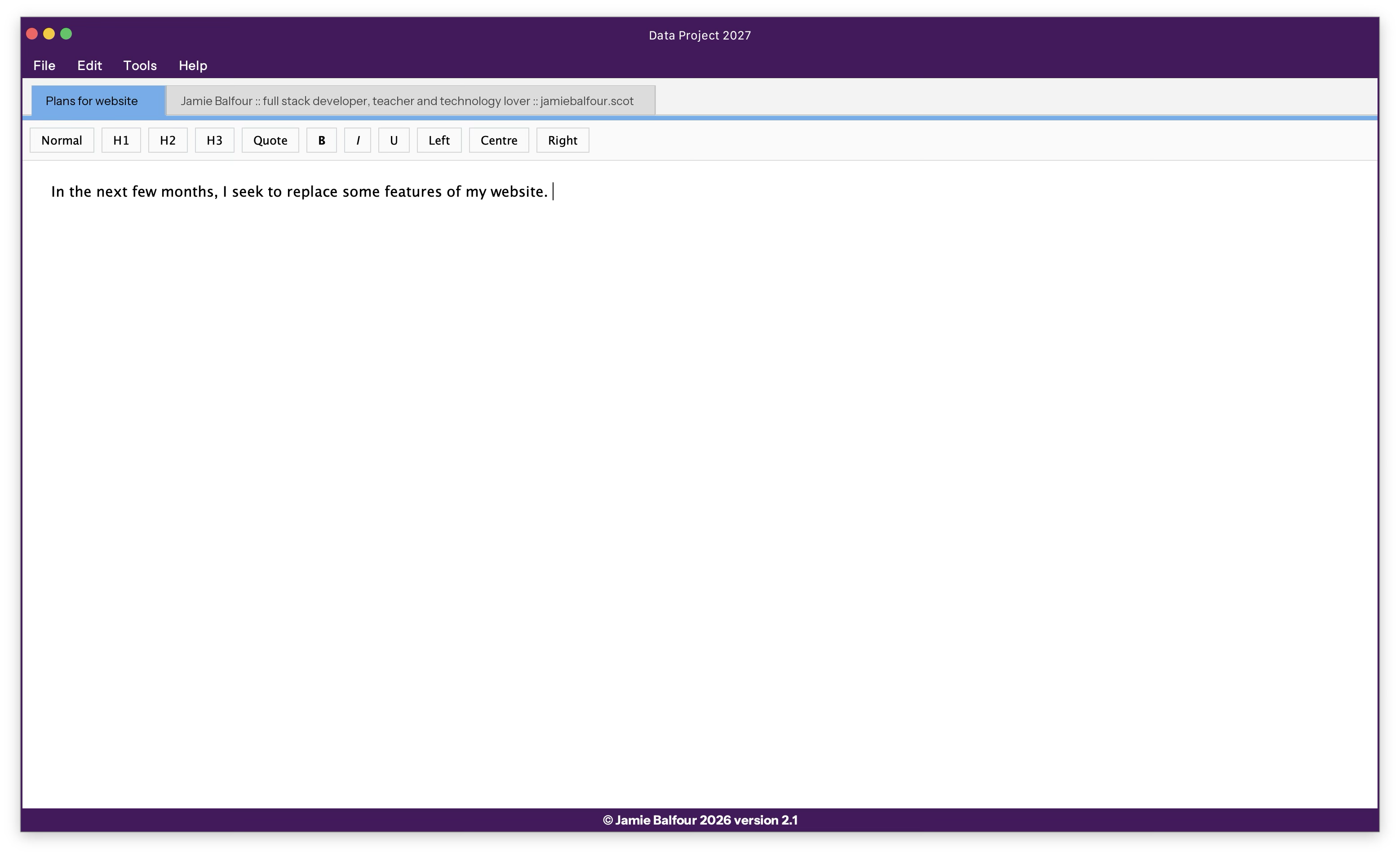
After 19 years, I've finally decided to revive one of my oldest projects, Data Project. Data Project started in 2007/08 as part of my FusionScape Ultra Edition. Eventually, it became a separate program.
The purpose of Data Project was to give you a single place to store things like research, documents, files, videos, pictures, etc., and to provide a very convenient way to transfer files. Data Project was originally written in a combination of VB.NET and C#.NET (the former since I started in VB.NET, but learned C# halfway through the development of Data Project).
Data Project was built alongside three other major projects: Painter Pro, Wonderword, and Cobweb, and it utilised components from each of them through my cleverly designed Balfour's Business Class Library.
Anyway, enough history. The new version, version 2027 (or version 2.1), is designed from the ground up with the same concept. It's built in Java this time for both cross-platform compatibility and to use my Macro Editor feature in ZPE. It's already taking shape, too, thanks to BalfLaf, which has revolutionised the way UIs are developed.