

This first article in the CSS tutorial on design will cover four concrete CSS concepts in relation to object layout; display, positioning, floating and visibility.
Display
The display property is a very powerful one and one of the best options for building a responsive site.
For instance, on this website, parts of the sidebar is hidden using <div style="display: none;"></div> so
that mobile users are not faced with things that would be too demanding.
Display does not just define the way that an element appears, it defines the way it is laid out on the page.
The following key values can be allocated to the property:
| Value | Purpose |
|---|---|
| inline | Displays like an inline element such as span or strong. |
| block | Displays like an block element such as div or p. |
| inline-block | Displays an element as being inline with all inner elements being block elements. Unlike inline elements it can be given a height and a width. |
| table | Displays like a table element. |
| table-row | Displays like a tr element. |
| table-cell | Displays like a td element. |
| none | The object is invisibile and takes it out of the layout. |
Although this tutorial only covers the key properties, the rest are available online at W3Schools.
The following are examples of each.
Inline-elements are particularly good for side-by-side displays, such as a main content and a sidebar.
Inline-block elements are identical to inline elements apart from the fact that they behave more like block elements. This can be said because inline-block elements can be given a height and width but also padding and margins.
Elements with set to display as tables will act as if they were tables. This means that they can also consist of elements with the
table-cell or table-row display property. This is useful for where a table is required for design and should
be used instead of an actual table element due to the syntactical meaning of a table element.
Position
The position property is used to define how the element is placed within the page. There are four core CSS positions;
static, relative, absolute and fixed. Each of these
values has it's own unique use, but some of them work similarly in specific
situations.
To position an element, position property is given one of these values. For example:
 <div style="position:
            fixed;"></div>
Static
Static positioning is precisely what it says, static. Giving an object static positioning is stating the object does not move. The majority of all elements on this website are given static positioning. It is also the CSS default value.
With static positioning, the
top, left, right and bottom
properties have no purpose.
Fixed
Fixed positioning refers to the type of positioning that means that the object does not move within the browser viewport. The menu on this website is given a fixed positioning,
Fixed positioning follows the scrolling of the page so it is always in the same place.
However, for an element to have some form of position when fixed, four new properties must be used (they need not all be used at the one time). These properties are used to define distance from the top, left, right and bottom of the browser viewport.
They are aptly named to the above mentioned points:
.fixedPos{
	position: fixed;
	top: 10px;
	right: 10px;
	left: 10px;
	bottom: 10px;
}
The
top, left, right and bottom
properties can all be given negative values.
For the above example, the element would be positioned 10 pixels from all four points of the window; meaning it will stretch nearly the whole window.
For a fixed menu, such as the one on this website, the
bottom
property need not be specified. The following example demonstrates this:
.fixedMenu{
	position: fixed;
	top: 0px;
	right: 0px;
	left: 0px;
}
IE7 and IE8 support the fixed value only if a !DOCTYPE is specified.
Relative
Relative positioning is defined as being relative to an element's static positioning. So if an element is positioned relative, it can be moved from it's original position using the top, left, right and bottom points.
.relative{
	position: relative;
	top: -10px;
}
Relative positioning will adjust the position of the element based on where it would be normally. E.g., if an object was actually just ten pixels from the top normally and the object was given the above CSS, it's new distance from the top of the page would be zero pixels.
Absolute
Absolute positioning refers to positioning an element in an absolute way - it stays in that place in the document no matter what (so when scrolling it can be left behind.)
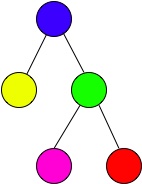
A DOM tree
Absolute positioning however also considers it's parent. So instead of following the flow of the document, it follows within it's parent.
However, for an element to be positioned absolutely it must have at least one parent that has some form of non-static positioning, otherwise it takes the document itself to be the parent with the non-static positioning.
In the tree example, if the red leaf in this tree is given absolute positioning, and the green node is given static positioning, then the red leaf selects the blue (root) node as it's relative parent to be placed within.
If the green node is given relative positioning, the red node with absolute positioning will select the green node as it's point to position from.
Because of the property of absolute positioning looking for a relative parent, it's very easy to position one item within another. It is important to note however that absolutely positioned elements have no effect on the flow of the document.
The following sample shows how absolute positioning works with the top, bottom, left and right properties.
.absolute{
	position: absolute;
	top: -10px;
	bottom: -10px;
	left: -10px;
	right: -10px;
}
Floating
Floating is another concept introduced in CSS that makes it easier to make elements sit side-by-side as the inline-block does. The difference is however, floated elements can have other elements wrap around them.
A floated element moves to one of two places; left or the right. The element forces itself to the furthest left or right that it can go until it can go no further.
The following sample demonstrates this using one of the floated elements on this website.

Lorem ipsum dolor sit amet, consectetur adipiscing elit. Quisque sed fringilla orci. Nam eleifend cursus purus non pharetra. Proin aliquam facilisis egestas. Nullam pretium ante velit, non iaculis eros lacinia a. Donec ut pretium velit. In auctor sit amet leo vel vulputate. Donec porta quis est ac semper. Vivamus eget nisl eu est scelerisque tristique vel tempus tortor. Donec dignissim tellus ut dictum efficitur. Quisque nec tellus ex. Vivamus vestibulum malesuada enim in condimentum. Aliquam euismod est in aliquet laoreet.
Float has three properties: left, right and none.
.right-float{
	float: right;
	margin-left: 15px;
}
.left-float{
	float: left;
	margin-right: 15px;
}
.no-float{
	float: none;
	margin: 0;
}
Margins will be covered in the next article. They are particularly useful here because they separate the text from the floated element.
Visibility
Visibility is used to make an element appear or disappear. It is similar to the display property of
none. The important
difference is that it's effect on the layout still remains when it is hidden.
Visiblity is rather simple in that it only has a few options. The options are shown below:
.visible{
	visibility: visible;
}
.hidden{
	visibility: hidden;
}
.collapsed{
	visibility: collapse;
}
The
visible
option, obviously, make it visible to the user again. The
hidden
option
obviously hides it from the user (leaving such layout traces caused by the element in tact). The
collapse
value
makes a
table
sub element (such as
tr
or
td
) disappear.
The
visibility: collapse
property and value combination only works on sub elements of the table
element.