
Long, long ago (maybe some 8 or 9 years ago) I was still a desktop software developer and a totally newbie to web development. I then came across a little something called clearfix. I saw how overly used clearfix was back then - almost every website used an absurd abundance of these little divs with the clearfix class on them.
But what was it and why is it so important that a mammoth number of websites out there featured it and is it still a thing?
First off I'll answer the latter question first, yes it's still a thing.
Secondly, clearfix is designed to stop elements with a float property floating over a block element:
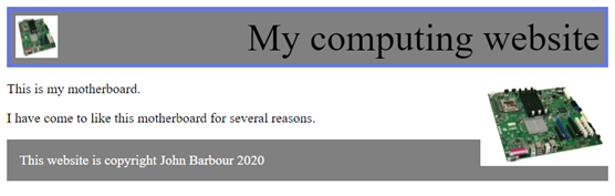
In this case, the footer is a block element and the picture of the motherboard is a floating element. Notice how it overlaps the footer.
To fix this, the footer is given the clear: both property.
Clearfix
So then you ask, what is clearfix?
Clearfix is, in a nutshell, a simple fix that stops things flowing without having to add clear: both to the following element. By taking advantage of CSS's pseudoselector :after, we can easily force any floating elements to be followed by an element with the clear property set correctly, we can stop the floating element floating over the element that follows it.
Do we still need it?
The answer to this is actually yes, for the most part. You see, backward compatibility will always be an issue that needs attention but also because the replacement isn't even all that great as of yet.
Normally, frameworks such as Girder, Bootstrap or Foundation will deal with the annoyingness of clearfix for you by adding it to classes such as the row (in Girder/Bootstrap) for you. So when you create two columns with the float property you wrap them in a row which features clearfix properties and stops the next content flying over the floating columns.
So clearfix is here to stay.
So it's that time in my life where I change browser again, which seems to be a regular thing for me. So much so that in my bookmarks folder there is a folder called Imported from Firefox which contains a folder called From Google Chrome which contains a folder called Imported from Safari which contains a folder called Imported from IE.
Chrome 76 is just around the corner, looking to a July 30th release this year, and it brings about a feature that the latest version of Firefox also includes. I speak of dark mode.
Dark mode is becoming a more and more popular thing with websites these days. And rightly so since developers like myself tend to be more drawn to the dark interfaces in the development programs (IDEs and text editors) that we use for the majority of our work. Well, now it's coming to browsers and Firefox already has it implemented.
Twitter and Facebook etc all have their own dark modes, but they are not implemented how it should be. The dark mode should be based on the operating system - both Windows 10 and macOS implement a system-wide dark mode that applications should be implementing too.
Chrome 76 Beta implements this. For those who follow me on my website, you may know that a few weeks ago I implemented my own version of dark mode that follows the operating system's dark mode preferences. If the browser has the feature it will turn dark too.
Here's my website in dark mode in Chrome 76:
First off, as a result of this new discovery, I have updated Girder and BalfBar.
I have recently been working on a new client website when I discovered what I'd say was glitch. This affects every website, every thing that I have worked on in the past few years and all my major projects and it's now fixed.
Every website I have ever created has been responsive since about 2012. As a result CSS media queries are a big thing in the design of these sites. However, it only came to me today that the way that these media queries work is not brilliant. Most crucially, this affected Girder and BalfBar on any website, but also affected my own website. Let's take a look at what this is.
The media gap
The two main methods of using media queries is using the min and max queries:
- @media only screen and (max-width: 768px)
- @media only screen and (min-width: 769px)
Combine these two queries to have a media query for mobile devices and a media query for desktop devices. All fine there. Except, there's a gap. If you can already see it then great, but if not let me explain.

First off, take a look at this graph. This what our media query would look like: left of the red bar is the mobile section and anything to the right of the red bar would be our desktop portion. But what about the red bar itself? This is where we have the issue, albeit a small issue, a complex issue to deal with at first.
It only struck me this afternoon that there are small gaps in the media queries developed for production that cause issues with this. The media queries do not specify what happens for the infinitely many real numbers that come between 768 and 769 such as 768.1, 768.2 or 768.35.
An important thing to note is that these media query issues only occur if there are two media queries back to back - one min and one max. Another thing to note is that > 768 and >= 769 are not the same here - this bit is key. This causes issues with things where the JavaScript and CSS are trying to achieve something at the same time.
A fix
A small fix I would suggest is adding granularity. For this example, a fix could be achieved with:
- @media only screen and (max-width: 768px)
- @media only screen and (min-width: 768.01px)
Another fix is to use just one media query here and stack changes in it. For instance, develop the mobile site then have a single min-width media query for all the changes applied to the desktop site. This is not ideal but it works and there's no need for the granularity with this type of query.
Why is this an issue?
The issue occurs with some browsers (such as Firefox) making some websites 767.200 pixels wide as opposed to a rounded number. There needs to be a better way to fix this issue.
This evening I discovered a little bug that affects all sites hosted that use my Girder Framework and whilst it's not an astronomical issue and doesn't affect usability, it's one that makes some websites I've built using my framework less attractive.
Tonight I speak of parallax.
Many of you will know that a few of my websites use a parallax effect in several places. One of the most obvious is with the Jambour Digital website. Today I discovered that iPads and iPhones do not support parallax background images properly. In fact, they don't really support the background-attachment: fixed property at all.
In some ways, this makes sense due to the fact that scroll events on iOS devices are only triggered at the end of the scroll, for instance. Another reason is possibly because of battery life.
But what really gets to me as a designer is Apple's lack of understanding for developers who develop this stuff. Since a fallback would be difficult and would require at least JavaScript, Apple should have some kind of a backup for websites that rely on this.
So please Apple, fix this!
We all know that responsive designs are the way to go. For a long time now my website has been fully responsive, but one of the features I used that was developed by someone else was the responsive table. For as long as I have had it in use on my website I have disliked it.
I dislike it because it shifts the first column of the table to the left, essentially floating it above the rest of the table, whilst letting the user scroll the rest of the table. It created an ugly, ugly mess of things being thrown all over the place. Alas, finding the best solution for a responsive table could be much easier.
What about using an overflow:auto and display:block on it? Good idea, but the problem is that now the tables will not stretch the full width of the container.
The solution I am now using is a combination of JavaScript and CSS. The solution involves using jQuery's wrap function like so: jQuery("table.responsive").wrap("<div style="overflow: auto;"></div>");which will wrap each table with the class responsive in a scrollable div (see, very little CSS and JavaScript). Also, by giving the table inside a minimum width of 100%, they will always stretch the width of their container (which is the wrapper div), ensuring that they are always 100% of the content.
The problem though is with the interaction design side of things - how are users supposed to know when they can scroll some table in the middle of the content?
After reading a few articles, I found a comment in one of the websites with a link to this page. This allows you to make scrollbars always visible - something that should not need to be hacked together but should be a CSS feature, but Apple and Google don't agree with this so we do need to hack it together.
Although this does not guarantee that users will notice the scrollbars, it does leave some possibility that they might notice them.
Tables are a difficult thing to work with and making them responsive is one of the most difficult things to do in terms of usability. Let me know if you have any solutions to these problems.
Here is an example table, resize your browser or use a smartphone to test it.
| Name | Platform | Year | Sales | Revenue |
|---|---|---|---|---|
| Warcraft: Orcs and Humans | MS-DOS and Mac OS | 1994 | 1,100,000 | $45,000,000 |
| Warcraft II: Tides of Darkness | MS-DOS, Windows, Macintosh, Saturn, PlayStation | 1996 | 1,000,000 | $50,000,000 |
| Warcraft III: Reign of Chaos | Windows and Mac OS | 2002 | 3,000,000 | $175,000,000 |
| Warcraft III: The Frozen Throne | Windows and Mac OS | 2004 | 5,000,000 | $95,000,000 |
It's considered pretty bad practice to use a class selector in CSS as a single instance, for instance, you would not choose to the name the main_container element .main_container, would you? Or would you?
Well actually, I was thinking about this today, and I've come to the conclusion that yes, maybe you would. That's because of the DOM buzz word specificity.
Any CSS developer who has been using it for a while will know that the ID selector (#) is more powerful than the class selector (.), but do you know how much more powerful it is? Well 10 times to be exact. For more information on this, read the linked article.
It's important to note that throwing in an ID selector makes it very difficult to overwrite, so using one is not always the best way to achieve something. For instance, say you wanted all the anchor elements inside your main body section to be displayed with a style where you've got the code such as:
<div id="main_container">
    <a>Test</a>
    <a class="tester">Test</a>
</div>
<div id="sidebar">
    <a class="tester">Test</a>
</div>
</div>
The anchors could simply be selected using the #main_container a selection. But this means, according to specificity rules, that the anchor would have 101 points (100 + 1), meaning overwriting this anchor with a class is not easy and would require the ID at all costs. Now you want to style the links with the class tester too, but across the whole site. So we have two choices, either rewrite the page so that the body has an ID too, or, create a selector like #main_container a.tester, #sidebar a.tester.
Both of these solutions are inadequate.
The single use class
Let's rewrite the HTML and CSS. Add the class singleton to the main_container:
<div id="main_container" class="singleton">
    <a>Test</a>
    <a class="tester">Test</a>
</div>
<div id="sidebar">
    <a class="tester">Test</a>
</div>
</div>
Now our selection can be much weaker, albeit less specific (but since singleton will only occur once and only once we do not care). We can now select using .singleton a. We have reduced the specificity to 11 (10 + 1). To overwrite it, we can now just use a.tester since this also has a specificity of 11 (1 + 10). However, this will only work if it is placed in the CSS file after the reference to the original tag (i.e. after the .singleton a).
So there you have it, a way to use the class selector as a single instance effectively.
A couple of weeks ago I posted an article about building a webpage with a fluid sidebar. I was completely unaware that this is actually a common issue, but I'm very proud to say that all of my solutions can also be found on the Wikipedia page on the Holy Grail (web design). A lot of my knowledge on this comes from my own experience with the issue, since my website actually follows this design pattern and I struggled to get it perfect.
Since the day Apple announced that they were going to drop their skeuomorphic design patterns, everyone has tried to follow suit - me included.
Skeuomorphism is all about making your design look like something from the real world - something I aimed to do with my website by making it look like a page on your screen (I have since dropped this and moved to a much flatter design).
But why is it that skeuomorphism has disappeared all of a sudden and what really is it?
In this post, I'm going to talk a little about what a skeuomorphic design would look like and why flatter designs are much more convienient.
Skeuomorphism
By building a system with a real-life-like design using a skeuomorphic design pattern you make the learning curve much smaller: what looks like a microphone is a microphone. This means that more time ends up being on developing the interface than with a non-real-life-like version.
Skeuomorphism has however one drawback. Complication. Whilst yes it is true that skeuomorphism reduces time spent learning the interface, it also complicates the interface. Buttons may not be so obvious, taking for instance, a volume toggle which you rotate. This would be obviously complicated unless you knew how to use it before hand. This is an example of skeuomorphism at it's worst.
Skeuomorphism also tends to rely on images and gradients as well as other computationally complex elements (including rounded corners and the like). All of this adds to the time spent loading the interface.
This div below appears with a skeuomorphic interface.
'Flat interfaces'
Flat may not be the best word to describe these interfaces but it's a good one. Microsoft was one of the first companies to introduce a flat interface with Windows 8:

Microsoft's website is an example of a flat design
The main benefit flat interfaces have over skeuomorphic interfaces is that they tend to be easier to produce and then tend to be easier to render on the client system. Flat design rely less on images, gradients, curved borders, box shadows and a lot of the new CSS 3 styles that are being added and goes 'back to basics'.
The focus of a flat interface is contrast, making colours the dividers, not box shadows. It also focuses on solid colours, not gradients. And finally, it attempts to make the interface more rectangular than circular (on this note, I may be changing my logo from the orb design to a more square design).
Below is an example of a flat interface (and also happens to be the style of the buttons on my website):
Flat designs do have a few problems however. The first and foremost obvious failing of these designs is that it is difficult to give it a personal feel. Almost all flat designs are in some way or another similar to the next. This ultimately is why flat designs work well however, since they are very easy to understand and are now commonplace.
More importantly, there is less of an oomph of feeling for the website. Since it can be difficult to make a flat design interesting and not just another boring website, it is very difficult to build a flat design effectively (I do not believe I've got my flat design perfect yet).
The future
The future may see the world go back to a skeuomorphic design again and like all designs, flat interfaces may only be a phase.
Whether or not the design will disappear or not, the design is here to stay for now.
The following image inspired me to write about this:
This image came from Web Designer Depot