

Since the day Apple announced that they were going to drop their skeuomorphic design patterns, everyone has tried to follow suit - me included.
Skeuomorphism is all about making your design look like something from the real world - something I aimed to do with my website by making it look like a page on your screen (I have since dropped this and moved to a much flatter design).
But why is it that skeuomorphism has disappeared all of a sudden and what really is it?
In this post, I'm going to talk a little about what a skeuomorphic design would look like and why flatter designs are much more convienient.
Skeuomorphism
By building a system with a real-life-like design using a skeuomorphic design pattern you make the learning curve much smaller: what looks like a microphone is a microphone. This means that more time ends up being on developing the interface than with a non-real-life-like version.
Skeuomorphism has however one drawback. Complication. Whilst yes it is true that skeuomorphism reduces time spent learning the interface, it also complicates the interface. Buttons may not be so obvious, taking for instance, a volume toggle which you rotate. This would be obviously complicated unless you knew how to use it before hand. This is an example of skeuomorphism at it's worst.
Skeuomorphism also tends to rely on images and gradients as well as other computationally complex elements (including rounded corners and the like). All of this adds to the time spent loading the interface.
This div below appears with a skeuomorphic interface.
'Flat interfaces'
Flat may not be the best word to describe these interfaces but it's a good one. Microsoft was one of the first companies to introduce a flat interface with Windows 8:
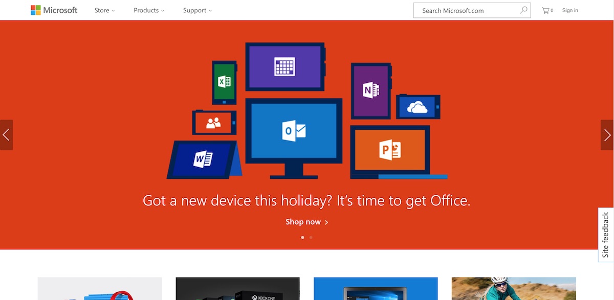
Microsoft's website is an example of a flat design
The main benefit flat interfaces have over skeuomorphic interfaces is that they tend to be easier to produce and then tend to be easier to render on the client system. Flat design rely less on images, gradients, curved borders, box shadows and a lot of the new CSS 3 styles that are being added and goes 'back to basics'.
The focus of a flat interface is contrast, making colours the dividers, not box shadows. It also focuses on solid colours, not gradients. And finally, it attempts to make the interface more rectangular than circular (on this note, I may be changing my logo from the orb design to a more square design).
Below is an example of a flat interface (and also happens to be the style of the buttons on my website):
Flat designs do have a few problems however. The first and foremost obvious failing of these designs is that it is difficult to give it a personal feel. Almost all flat designs are in some way or another similar to the next. This ultimately is why flat designs work well however, since they are very easy to understand and are now commonplace.
More importantly, there is less of an oomph of feeling for the website. Since it can be difficult to make a flat design interesting and not just another boring website, it is very difficult to build a flat design effectively (I do not believe I've got my flat design perfect yet).
The future
The future may see the world go back to a skeuomorphic design again and like all designs, flat interfaces may only be a phase.
Whether or not the design will disappear or not, the design is here to stay for now.
The following image inspired me to write about this:
This image came from Web Designer Depot

There are no comments on this page.
Comments are welcome and encouraged, including disagreement and critique. However, this is not a space for abuse. Disagreement is welcome; personal attacks, harassment, or hate will be removed instantly. This site reflects personal opinions, not universal truths. If you can’t distinguish between the two, this probably isn’t the place for you. The system temporarily stores IP addresses and browser user agents for the purposes of spam prevention, moderation, and safeguarding. This data is automatically removed after fourteen days. Your email address is stored so that replies can be sent to your email address.
Comments powered by BalfComment