
An important next step is to know the layout of a website, before any code is written, and to ensure it is sound with users. One way of doing this is through wireframing or a mockup.
Paper prototyping
Before even using a computer it is sometimes a good idea to begin to construct the layout on a piece of paper. An initial layout done on paper is very good as reference later.

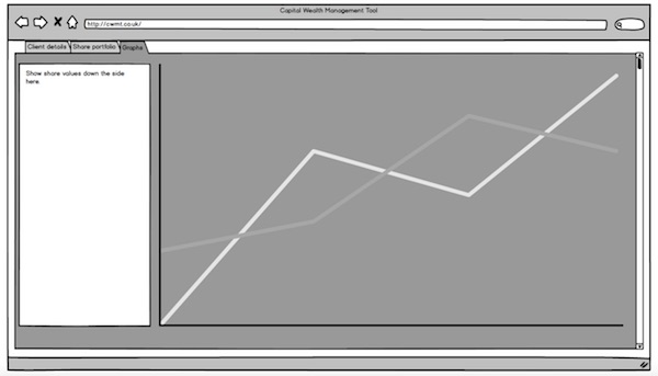
A paper prototype
The main advantage of paper prototyping is the cost. It's far cheaper to jot down ideas on paper than it is to think ideas up at a computer.
The biggest disadvantages of paper prototyping are that there is no limit to what can be done, but when it comes to actually building the website there are limitations. These are simply not clear with a paper prototype and some of the original paper ideas cannot be realised when building the actual website.
Wireframing
Wireframing or mockup designs are both very useful for creating an initial website design. For larger projects it is a must to build a prototype first.
A mockup website created with Balsamiq
Wireframe designs are used to keep the cost down whilst also providing a method of building layouts that are feasible in web development. This is the obvious advantage they have over paper prototypes. They can also be altered and duplicated much easier.
Wireframing can be done with many different pieces of software such as Balsamiq Mockups or Axure and can be done with any number of these wireframing software applications to get a better idea of how the final website would look.
Wireframing involves putting elements in places where they should be when the website is being built. This allows developers, particularly when there are multiple developers and they are working together, to have a good idea and plan as to what the finished website will look like. Another major advantage of wireframing is it allows developers to have a rough idea of the timescale of developing the website.
Basic layout considerations
It is important to consider the layout of the website from the offset. A website should strive to make the layout simple and well designed. A well designed website will follow rules and standards that make the website easy for users to understand and it's content should be appropriate based on what the user is looking for (accurate) and eliminate the need for the user to think about what they have to do (usable). The website should carry this theme across every page on the website or at least every page in the main body of the website (consistent).
There are several different templates for front-end development that make it easy to develop a website. Each of these templates has it own unique style. It is also the focus of this tutorial however to encourage readers to develop their own unique styles.
Grid layouts
Many layout designs exist across the web. One of the most common grid layouts is the single column layout. This layout focuses on a central container (much like this website) that takes up the centre of the page. The container sits in the middle of the page and is either surrounded by a background colour or background image, or is surrounded by whitespace. It is often a simple distinction that is made as to whether or not a website should follow the single column rule or to go for a full window page. One of the caveats of using the single column design is that it needs to be modified heavily to work on mobile.
It's important to note that many websites follow the single column design with a central page but use a larger sized container because on a larger resolution display such as 2560 by 1440 the container becomes too small. These pages often shrink the container to fit smaller displays too. This is described in the responsive design section of this tutorial.
Often it is the case that websites have a sidebar. This sidebar often contains links to news and blog posts, or in some cases the categories in a blog. The sidebar takes approximately one third of the space of the parent container but is often hidden on smaller devices such as mobile devices.
One example of a website that both follows the single column rule and uses a sidebar is the Sony Music website:
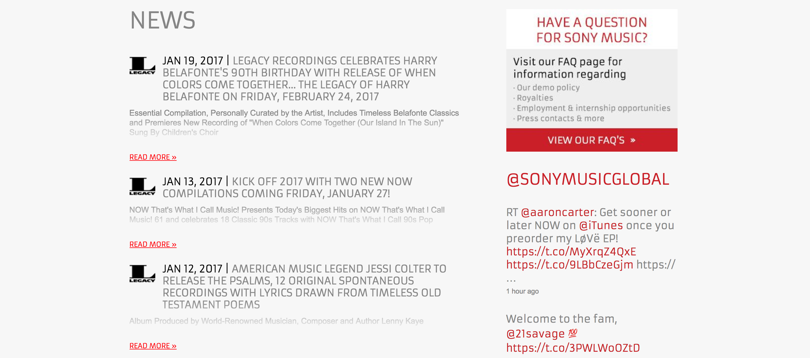
In the example site above, with the Sony Music website, the central column has a considerable amount of whitespace either side of it. This section has a maximum width of 960 pixels.
Full screen
A single screen website fills the whole web browser all of the time. It then shrinks down as the window becomes smaller and scales up when the window becomes bigger.
These websites often have a very clear message in big and bold writing. However, they often lack on upfront information and users will often need to visit another page on the website in order to get the information they actually came for.
In theory however, this type of site should sell the subject better than most others because the emphasis is exclusively on the subject.
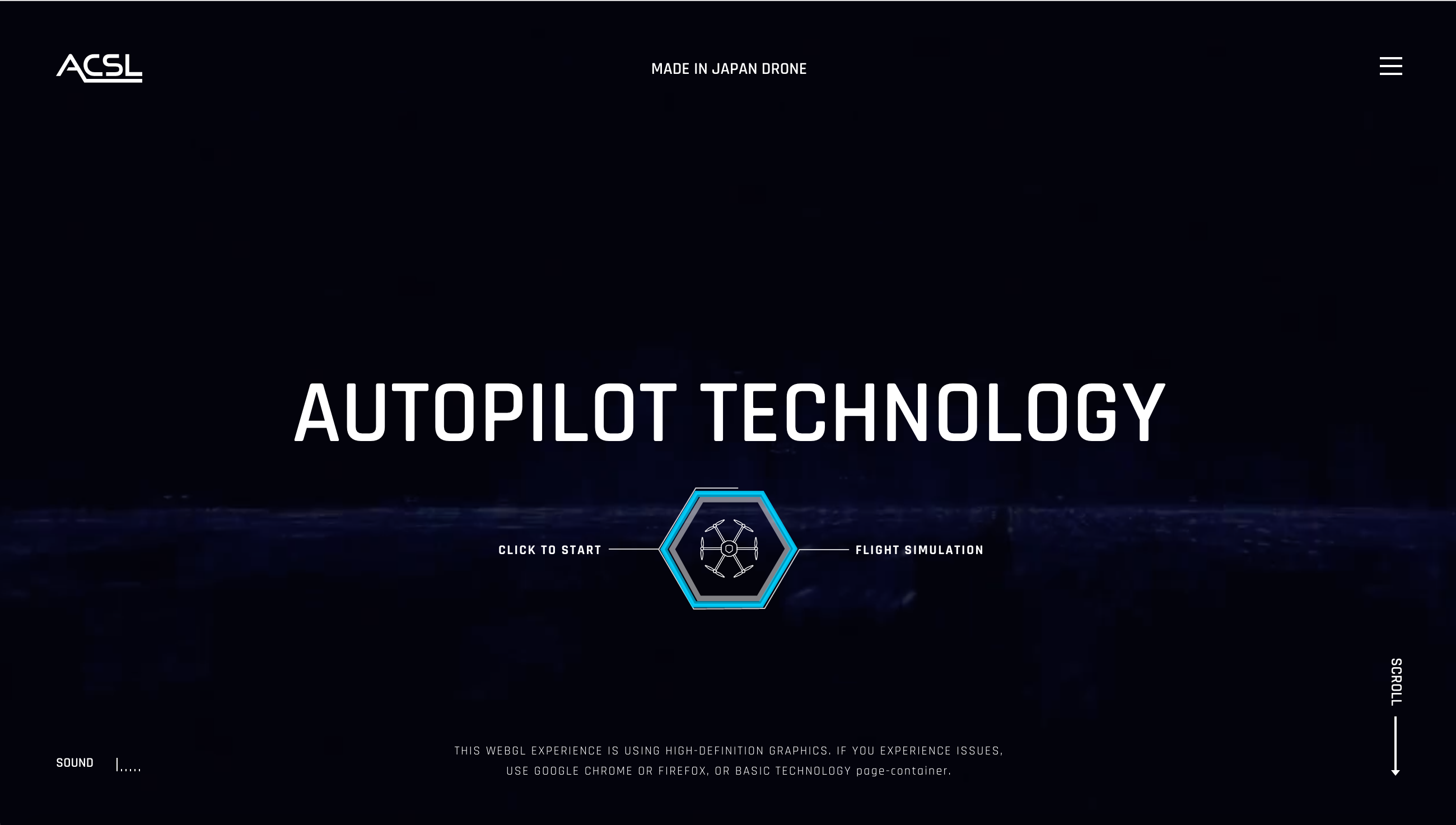
Some examples of really well developed full screen websites include:
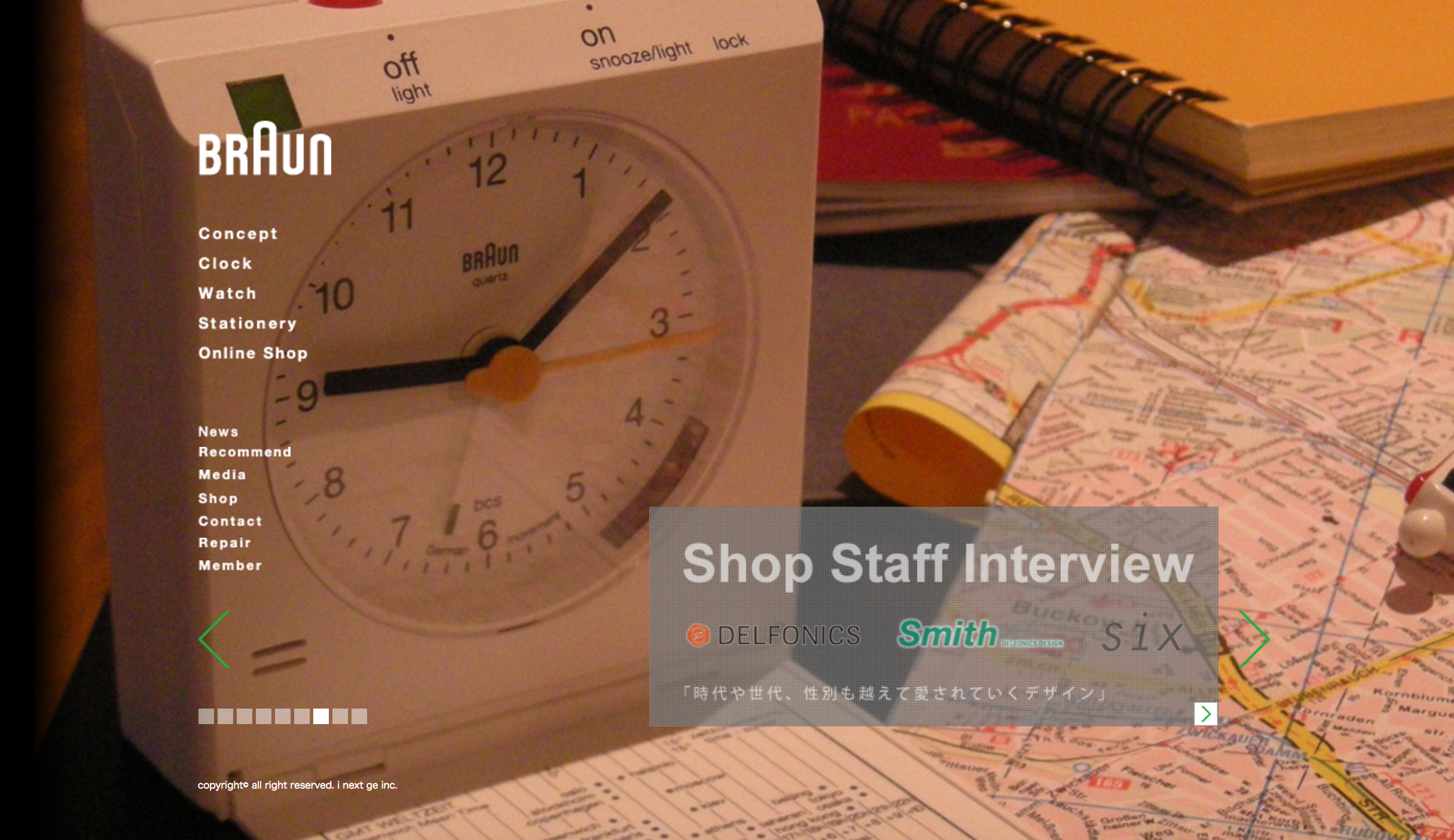
No chrome
The "No chrome" style aims to reduce design elements and focus further on the subject of the website. These types of websites are particularly used with products and services rather than individuals' personal websites.
No chrome is a more difficult to master than the other two mentioned designs, and it's effect is dependent on what product is being sold. For instance, the Braun.jp website features very little in the way of design elements and focuses mostly on the product itself.