

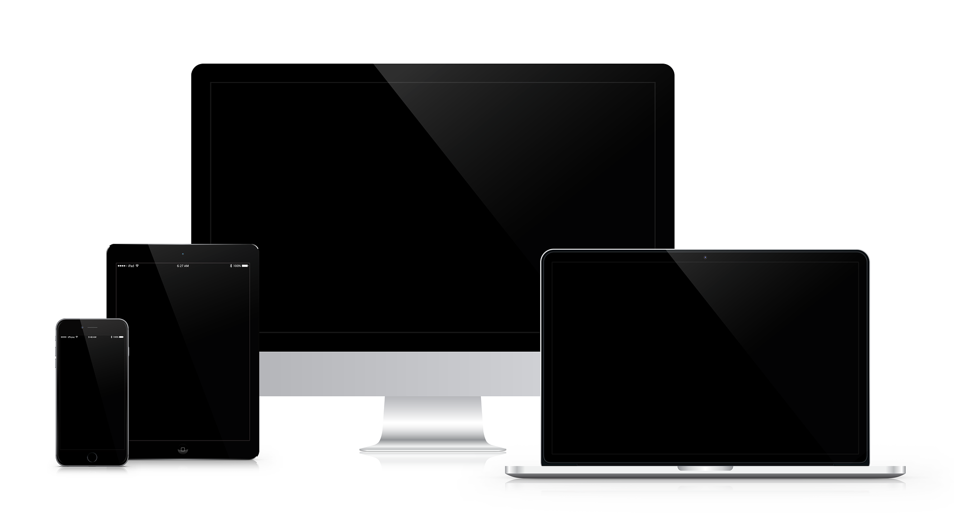
Responsive web design is an important part of any website nowadays. Modern-built websites should all implement this design strategy.
Responsive design refers to building a website that is independent of the output media, that is, for instance, a screen.
Due to the advent of smartphones like the iPhone, websites have needed to cater for more than desktop computers. As such, CSS had to pull it's weight and play catch up to try and develop a way of making existing and future websites work properly on mobile devices.
The result was the quickly-released CSS 2.1 specification (CSS 2.1 had not been fully implemented by June 2015 by any browser). The CSS 2.1 specification was a revision to CSS 2 which added features for responsive web design, namely the @media rule.
This article will look at techniques for responsive design and how CSS can achieve them.
Core features of a responsive website
There are several very fundamental features of any website that is considered responsive. For the majority of these features it is about size and how it appears on a smartphone. For instance, 10 pixels on a smartphone may appear too small or too large on a desktop computer.
As well as font sizes, there is the consideration of widths. The smartphone display is not as wide as the desktop display and as a result must take that in to consideration. To achieve this, widths are always given up to 100% of the display.
A 960 pixel wide website
Some websites will use a width of 960 pixels to achieve the effect of the website sitting in the middle of the page.
This can be solved by using two CSS properties; max-width and width. Using
both of these properties together will give the result:
#page {
	padding: 10px;
	max-width: 960px;
}
A resizing website
A website could on the otherhand resize as necessary. This is achieved with media queries.
Media queries allow the device to adapt based on certain properties such as the width of the device. For instance, this website will scale down based on the width of the display. They also mean that certain elements can be hidden on smaller devices such as smartphones.
@media screen and (min-width:768px) {
	.mobile_only {
		display: none;
	}
}
@media screen and (max-width:767px) {
	.desktop_only {
		display: none;
	}
}
Media queries are considerably more effective than using properties to restrict width due to the fact that certain elements can be completely removed based on the properties of the device.
Media queries are not limited to the width of the device, there exist several different options to focus on a specific type of device:
| Media query | Example |
|---|---|
device-aspect-ratio |
device-aspect-ratio: 16/9 |
device-width |
device-width: 768px |
device-height |
device-height: 200px |
max-device-height |
max-device-height: 200px |
orientation |
orientation: landscape |
There are several others and the Mozilla Developer Network has them covered.
Alternative methods
There are other ways of making a website responsive, most of which do not actually get used on a daily basis.
The key one that stands out is using a server side scripting language such as PHP to assess the user agent string of the device and then making decisions as to whether or not to attach a class to an element or to include the element at all.
<?php
	if($isMobile)
		echo "css/mobile.css"
	else
		echo "css/full.css"
?>