Well, despite the new changes coming in on Monday last week, I have had several messages saying they liked the grey design on my website and did not like the dark sidebar I was testing.
I am happy that I received this feedback as I also agree with those people since going back. Thankfully, I left the CSS in the file but gave the sidebar a new class that changed it to the dark mode.
I came up with a slightly new design for the sidebar just this afternoon that I feel makes a much flatter, better design. I hope you like this as this should be the final modification to the website for a long time.
Most of my focus is on improving my blog at the moment.
Anyway, I'm off to enjoy the remaining three days of my holidays now!
I sometimes just sit down and look through my own website for criticism rather than anything else.
My website has become the HUB of everything I do now. You can find out about me, read tutorials by me, find my CV, find photos of my places I've been, my life, family and pets and more, access my university stuff, download and read about my software, here what I have to say and more.
I don't often sit down and review my website but as I've got a chance, I'd like to tell you the truth about some recent events.
As one person knows, the person I know who cares about my website and one of my best friends in life, I considered completely getting rid of all the work on my website and changing my website entirely to Bootstrap, convinced that it was time for a major change.
To me now, the very fact that I was thinking this was even silly. I say this because I now know this website is me. I've built it.
I've had some comments from lecturers, friends and family and lots of others who have said my website is nice. But to me, there is always a need to change it more and more as you will have seen if you come here to view my blog or whatever on a regular basis or something.
The only problem is, whenever I write an article, tutorial or blog post or something, I always get distracted and end up changing something on the site.
I'm trying not to modify my website any more at all - trying to keep it consistent I think is what I'm trying to say.
I'd like to point out that alpha.jamiebalfour.scot, a subsite of this website, is nothing more than a concept - even it's front page explains that I never thought about doing that!
The alpha site never came to be the future of my website. It was overloaded with things I didn't need and it didn't represent me the way my own styled website does.
I am experimenting a slightly new design with the sidebar on my website at the moment.
Instead of the standard white sidebar, I have taken inspiration from one of the websites I built a couple of days ago for a company.
Feedback on that company website has been really powerful - most of which stated they liked dark sidebar and the bright content section. They also said they preferred the left hand sidebar to the right hand sidebar.
All of this got me thinking about my own website design too. So I decided to implement it here too.
For a long time, I have been looking into new ways to improve my website, particularly the desktop website as I really like the mobile and tablet versions of the site (this comes from the fact that they had more skill put into them as I had learned more by then).
My mobile and tablet website stay exactly how they were before - perfect.
If you like or dislike, let me know.
Oh and I will be bringing a new feedback form to my desktop website.
I had been planning a single login system for all for quite some time but now it is finally here!
My single login for all is cross-domain between all of my subsites and both the .com and .co.uk sites. It also works on the blog, so if you are a member of my blog it's easy to login to it now, using the same way you are used to with the standard login page.
If you visit my gallery a lot, you may notice that the photos are often slow to load and slow the page loading down. Well not anymore!
Thanks to a new script I produced for it, images load asynchronously with the main page and no longer slow down the download speed.
As a result, images take a few seconds more to load fully, but the page will load completely around them.
Today, I discovered a few security enhancements that I could apply to my website so in the next few days I will be working to improve the login system further as well as making the site more reliable when dealing with threats.
I'd like to thank Jonathan for his unsuccessful attempts at breaking into my website and Ben for suggesting it.
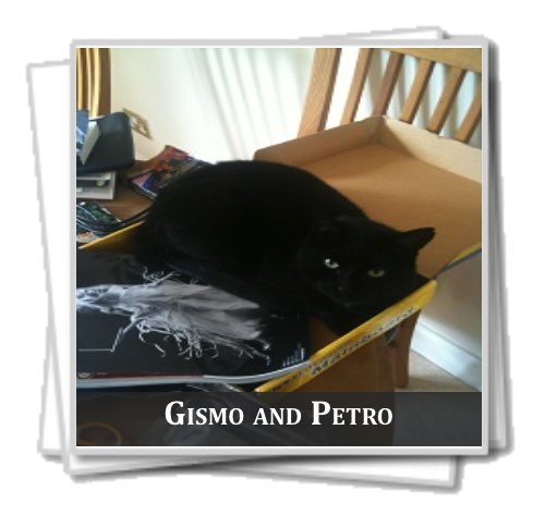
There are more photos in my Photo Gallery of Petro.
I have mentioned that I would be adding new tutorials to my website in the past so this may not necessarily be new news, but hey, nothing like a site update.
Most recently, version 3.6 of my website was released, a new version in the way the site is coded, making the site more consistent on the server side and easier to manage.
Very recently after, I started to work on a new tutorial on CSS. This is the first of many planned tutorials and will hopefully be finished by May this year. As well as this, I've had emails and comments stating that my PHP tutorial is good, but since reading through it myself, I find it a bit too short and have decided to extend it far further with a new section on Advanced PHP planned.
These are all planned for the CSS tutorial:
- Width, height, padding and margins
- Borders, box shadows, border radius and box sizing
- Colour, backgrounds and gradients
- Fonts, font families, font weights and styles
- Pseudo-CSS selectors
- Advanced pseudo-CSS selectors
- Adjacent sibling selector
- Child selector
- Descendant selector
- General sibling selector
- Universal selector
- Minification and combining CSS
- Optimising CSS
- Cross platform and browser compatibility
- jQuery and CSS
- Shorthand CSS
- CSS @ rules
- Precedence and specificity
- Server side generated CSS
- Introduction to responsive web design
- Tablet and smartphone friendly CSS
- Printer-friendly CSS
- Advanced responsive CSS
- CSS content
- CSS transitions
- CSS transformation
Bringing it all together
Yesterday I worked tirelessly to make my site more modular and many new fixes. On top of that, I have just made my site far more flexible and easy to update.
I'm expecting to be able to work on my site in a far better way now as well, keeping it far more flexible and making changes far easier. As a result I released version 3.6 just yesterday, 1st January 2015.
Happy 2015!
Since I started my website, I've been putting in loads of little things that make my site more attractive.
In my eyes, CSS is one of the best things to come to the world, because with it your creativity can flow wildly and you can build sexy sites.
Anyway, enough about that and enjoy some of my favourite styles and features of my site. Each of these elements is entirely my own work - none of the styles are taken from others. This post will not be focusing on my blog although I created it.
Note
My note is used to represent something of importance that should be noted.

Code sample
My code sample is used to display code in it.

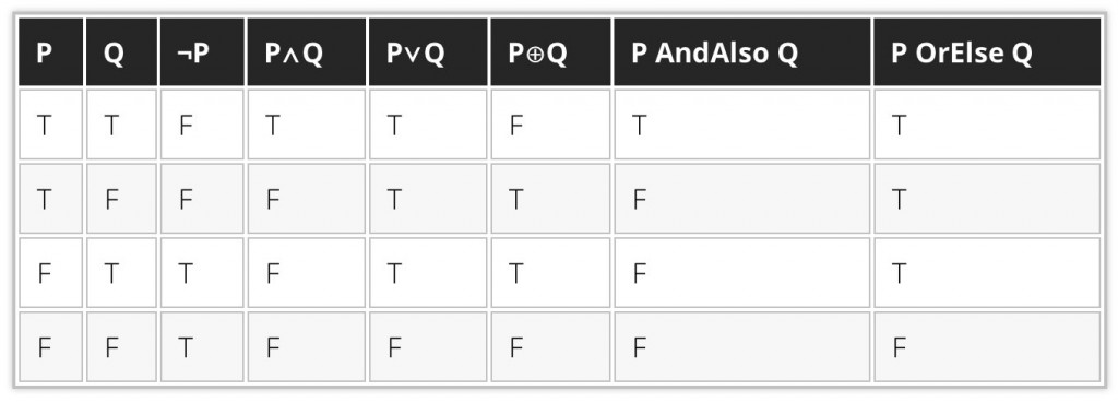
Data table
My data table is used as a table designed for holding data, rather than being used for any form of layout. The black style was inspired by the dark mode on my site.
The inline code sample
My inline code sample is used to put code in the middle of a paragraph of text.

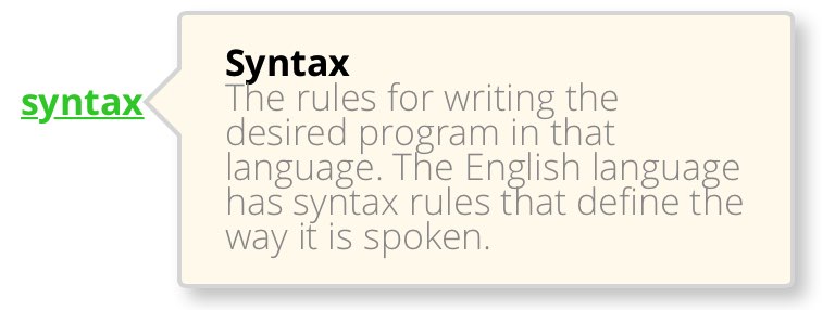
The tooltip
My tooltip is used within an article or page to represent information that should likely be already known and is left out of the main body of the article. Hovering the text will make the tooltip bubble visible.
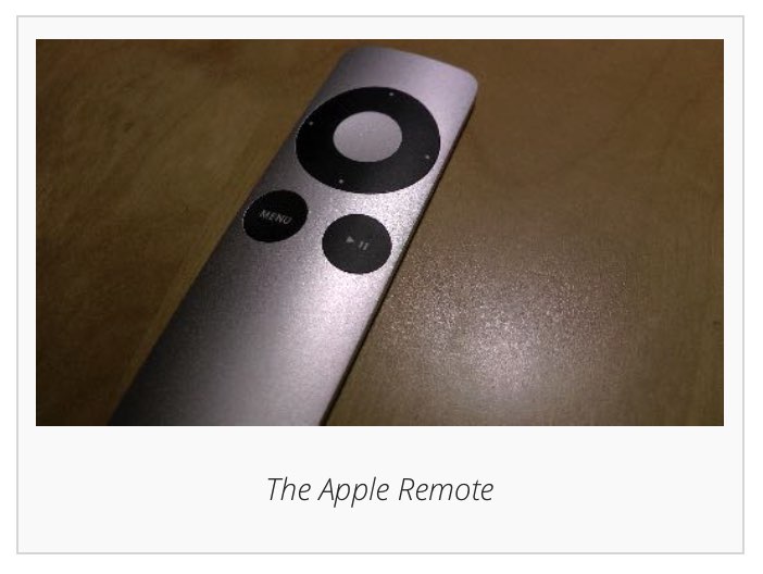
The image frame
My image frame is designed to hold an image. It also has space for a caption below.
The block image frame
My block image frame is different to my standard image frame in that it will take precisely 50% of the content space (minus padding and margins) and if another image goes to the side will begin floating to one side.
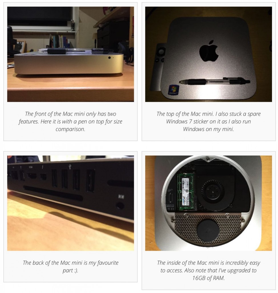
The photo gallery album container
The album container is a feature of my photo gallery that many find particularly nice. This is used to hold a front photo of a collection of photos.
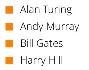
Colourful lists
In Novemeber, one of the features I decided to build was a collection of different colourful lists. A few have said they are very full of character and bring some nice new design features to my site.
The floating logo
I've had loads of comments from people who like my logo, but also people liking the fact it floats over the page.

The lined document
This document style that looks like a lined piece of paper was designed for keeping notes on my site. I use it in the University section.

