

Web design conventions are there to help! They make it easier for the viewer to find what they are looking for without having to look around so it is important to follow them.
1. Logo placement
Websites have since the beginning of web development almost always stuck to the rule that the logo for the website should be in the top left corner. It should be immediately visible to the user when they arrive at the website and should be persistent throughout the website, this way reminding the user that they are using the same website.
It is often the case that the logo follows the user around the page, for example on this website. Again, this is good for reminding the user that they are still on the same website.
Whilst it is not convention, it is often the case that clicking the logo will take the user back to the home page of the website.
2. Search box placement
A website that features a search box makes finding content on the site easier. Search boxes have existed since some of the earliest websites and placement of these has become a convention in its own right.
Most users expect that a search box appears somewhere in the top right of the website and want it to be easily accessible. This convention is often broken, but done effectively, such as placing it in the top left such as with Facebook.
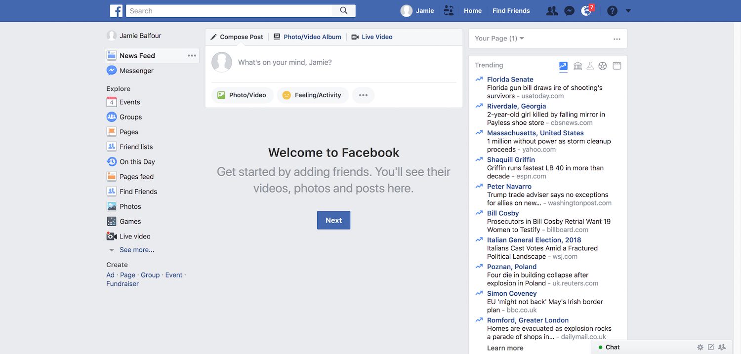
Facebook uses a left aligned search
3. Navigation placement
Website navigation menus are designed to be the easiest method of navigating a website. This is why their prominence is very important - for instance, putting a navigation menu half way down the page is a very bad idea.
As a result of this, a convention relating to the placement of menus strongly encourages designers and developers to place the navigation near to the top of the site.
Nowadays, floating menus are more commonplace than static ones - this helps usability by making it even easier for a viewer to change to a different page if they scroll down passed the menu. Take this website for example; it uses a static menu that becomes a floating one - this is even more powerful than a permanently fixed menu because it then draws the viewers attention to the fact that the menu has changed (or at least animated). The menu, however, remains fixed at the top of the website.
4. Styles
When talking about styles it has to be mentioned loosely because every website features it's own intrinsic design otherwise it would not be unique. But it's important to note that the conventions can be modified to suit the website.
In particular, style conventions that a website focuses on are those of links, buttons and input elements. For instance, a link is typically underlined with a solid line or represented with a different colour being used. For example, this website shows a link in orange and underlined: go to the home page.
Input elements should also stand out and be obvious. This website wraps labels with labels such as:
This makes it clear to the user what the input requires.
Finally, styling of buttons should make them obvious and stand out from other elements. Using box shadows and rounded corners may be somewhat akin to the conservative skeuomorphic design model, but they also can signify a 3D object in a flat interface effectively and can be used to make a button element stand out.
5. Visual hierarchy
The term visual hierarchy references the way in which content is laid out. Much like typing a document in a word processor, websites must follow a content structure. Within the domain of website design it refers to properties of a document such as title order and size as well as positioning of elements.
Visual hierarchy may be the most important of the points raised in this article because it allows a viewer to follow a systematic approach to reading - large to small is the standard. This means the title at the top should stand out more than its sub-titles.
HTML was not designed on nothing. It was designed with the intention of making a coherent
markup language. That's why the <h1>, the
<h2> etc. elements exist and why, by default,
browsers make them smaller as the number increases.
This is also important for search engine optimisation.
Don't Make Me Think
Inspiration for this tutorial originally came from Steve Krug's Don't Make Me Think which discusses web and mobile usability.
Within this book, Krug mentions a very important point that designers often feel that they need to break out of these conventions and reinvent the wheel to develop something new because:
Praise from peers, awards, and high-profile job offers are rarely based on criteria like 'best use of conventions'
The World Wide Web should not be like this!