

Back in the day prior to the advent of the mass smartphone market, only those geeky enough (like me) or those who absolutely needed to browsed the web from a smartphone or mobile device. Now millions of people browse the web every second.
Prior to the mass marketing of smartphones, some web sites were pushing the size of 10MB per web page because not only were internet connections becoming faster but computers themselves could process more.
All of a sudden this device known as the smartphone came along. It changed the web development market and industry all together.
HTML5 was first announced in 2004. It made it to a level ground where it had video and audio support just before the boom of the smartphone and Steve Jobs' critisism of Flash. Jobs actually was correct in what he said, Flash is old and clunky and adds to the download time. Users were expected to use plugins, something many of us don't even think about these days (I for one do not install Flash on either of my Macs and I've never had any problems whatsoever with either).
Before all of this happened website were going crazy with backgrounds, CSS and JavaScript whilst also relying on Flash and other plugins. In fact some sites didn't really even use CSS or JavaScript but were pure Flash and HTML implementations.
The point
Sites have become easier to make. Building a responsive siteResponsive siteA site that works across multiple platforms including smartphone, tablet, TV, desktop, printer and so on. is very easy (although some do require some effort, as my own one did as it tries to make the mobile site look different from the desktop).
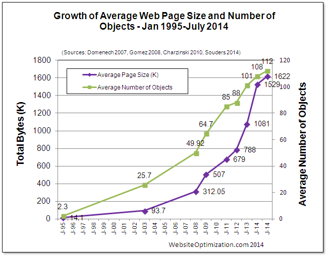
Taken from WebsiteOptimization.com
Web pages and all the CSS and JavaScript that they bring with them were too large for the smartphone user whose data allowance was capped.
In 2008 webpages actually became a lot better - they got rid of high resolution images and replaced them with both a mobile version and a desktop version (not easy, but I will come to that), they cut down their CSS and JavaScript and removed Flash dependancies.
But something new came along - responsive web design. The whole idea of a responsive website design meant ditching those old mob. subdomains (such as http://mob.jamiebalfour.scot) and making the same page available to both mobile and desktop users, just with different usability features.
Did you notice all those companies that have recently redone their whole website? But there are still hundreds of websites that still lack the responsive design and they are loosing money because of this (still my website is a hobby, even though I have built it into a responsive design).
Many websites have hundreds of incompatibilities with the latest standards, try validator.w3.org to get an idea as to how many errors a web page produces.
Building a site for mobile and desktop is difficult and in no way easy. I am not talking about responsive design here, more about trying to keep the size of the web page down for mobile users whilst giving desktop users that fancy upper edge. My site achieves this to the full.
On my site, desktop users experience that upper edge as they can see my latest blog posts and my Twitter feed, they have the Google adverts (not that this is a benefit but it is there no the less), the sharing buttons, they can contact me directly from any page as well as being able to personalise the site settings (this is found at the bottom under Site Links > Website accessibility).
On top of that, the menu is much fancier. Instead of being that boring old drop down list thing that most mobile websites use, it features a multi-level drop down - oh heck, look for yourself.
Generally, my site is aimed at the desktop, and that's not to say I neglect the mobile user (as the site is still completely usable on mobile and is still incredibly sexy in my opinion), it's just I spend more time designing a fancy desktop website.
The solution
My front page comes in at 2.20MB (not including the landing page). I change to my iPhone and load the front page. It comes in a 978KB. What on earth is going on? A bit of fancy magic, that's what.
I use a special PHP class called Mobile Detect, which allows me to use user agent sniffing to detect which browser is being used. If the user agent is detected as being one of the mobile user agents, then when the server generates the file it leaves out all of the heavyweight stuff like my sidebar (which is not used on mobile or tablet devices anyway).
In turn all of that work reduces the file size from a large 2.20MB to 978KB (yes the advertisement, Twitter and sharing buttons add all of that extra stuff to my homepage, terrible eh?). But it does not solve the problem entirely. I still have the problem that images on my website are large.
My trick
For those less interested in a bit of good old JavaScript, this may not appeal to you.
This script is something I've been wanting to do for a while and I have finally decided to do it.
This script requires some HTML5 support on your website.
<html>
	<head>
	<title>Test page</title>
	</head>
	<body>
		<img src="" data-dt-src="/articles/assets/2014/04/how-to-effectively-build-a-both-a-mobile-and-desktop-site/img1-desktop.jpg" data-mob-src="/articles/assets/2014/04/how-to-effectively-build-a-both-a-mobile-and-desktop-site/img1-mob.jpg">
		<img src="/articles/assets/2014/04/how-to-effectively-build-a-both-a-mobile-and-desktop-site/" data-dt-src="/articles/assets/2014/04/how-to-effectively-build-a-both-a-mobile-and-desktop-site/img2-desktop.jpg" data-mob-src="/articles/assets/2014/04/how-to-effectively-build-a-both-a-mobile-and-desktop-site/img2-mob.jpg">
		<img src="/articles/assets/2014/04/how-to-effectively-build-a-both-a-mobile-and-desktop-site/" data-dt-src="/articles/assets/2014/04/how-to-effectively-build-a-both-a-mobile-and-desktop-site/img3-desktop.jpg" data-mob-src="/articles/assets/2014/04/how-to-effectively-build-a-both-a-mobile-and-desktop-site/img3-mob.jpg">
		<script>
			var isMobile = true;
			jQuery(window).ready(function(){
				jQuery('img').each(function(){
					var srcdt = jQuery(this).attr('data-dt-src');
					var srcmob = jQuery(this).attr('data-mob-src');
					if(isMobile){
						jQuery(this).attr('src', srcmob);
					}
					else{
						jQuery(this).attr('src', srcdt);
					}
				});
			});
		</script>
	</body>
</html>
For the sample above, you should note that each img element must have it's src attribute specified to either an empty string ("") or some image. Also, the isMobile function has not been specified and is left open to however you wish to implement it or read on to find a rather simplistic approach to it.
The following is an example CSS and JavaScript implementation of the isMobile function:
@media screen and min-width:1025px {
	.tabmob_only {
		display: none;
	}
}
var isMobile = false;
window.onresize = function(e) {
	if(window.innerWidth > 1025) {
		isMobile = true;
	}
}
Conclusion
Building a responsive site is an easy and reasonably quick task.
On the other hand, optimising a site for mobile users as well as desktop users is a relatively cumbersome task - not only should the site be lightweight enough to be usable on a mobile phone where there is a data limit, but there should be support for desktop users with a lot more data to use who wish to see a good website.

There are no comments on this page.
Comments are welcome and encouraged, including disagreement and critique. However, this is not a space for abuse. Disagreement is welcome; personal attacks, harassment, or hate will be removed instantly. This site reflects personal opinions, not universal truths. If you can’t distinguish between the two, this probably isn’t the place for you. The system temporarily stores IP addresses and browser user agents for the purposes of spam prevention, moderation, and safeguarding. This data is automatically removed after fourteen days. Your email address is stored so that replies can be sent to your email address.
Comments powered by BalfComment